The end of the media queries?
Como CaFE ∙ 13 February 2019
History
The beginning
- 960 * 600
- Safe Area
- Pixel perfect
Tools available
<table>position: absolutezoom: 1
Everything else
⚡️ Flash
2005: Mobile
- domain .mobi and m. sites
- 2 different websites
- from big to small
Tools available
... almost the same
2008: Fluid
- 2002 Jim Kalbach: audi.com
- 2010 RWD by Ethan Marcotte
- 2013 Year of RWD by Mashable
Tools available
- 2009: media query [spec started in 2001]
- grid systems [2011 Bootstrap]
2009: Mobile first
“Reverse Responsive” Web Design
- from small to big
Tools available
The same with a focus on the exclusive use of `min-width` media query
Today
Components
- 2011: Web Components
- 2013: Atomic Web Design
- Pattern libraries
- ...
Tools???
2014
Container/Element query?
W3: Nope...
Cyclic Dependencies
Polyfill
Slow performance
<iframe>
Dirty hack
Houdini
Too early
So what?
Responsive
!=
Media query
Reflow handling
Float
Yes, is still available
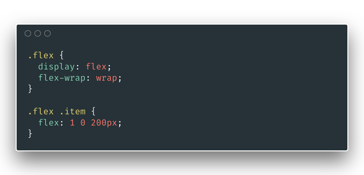
Flex
Flexible Box Layout
2009 -> 2012
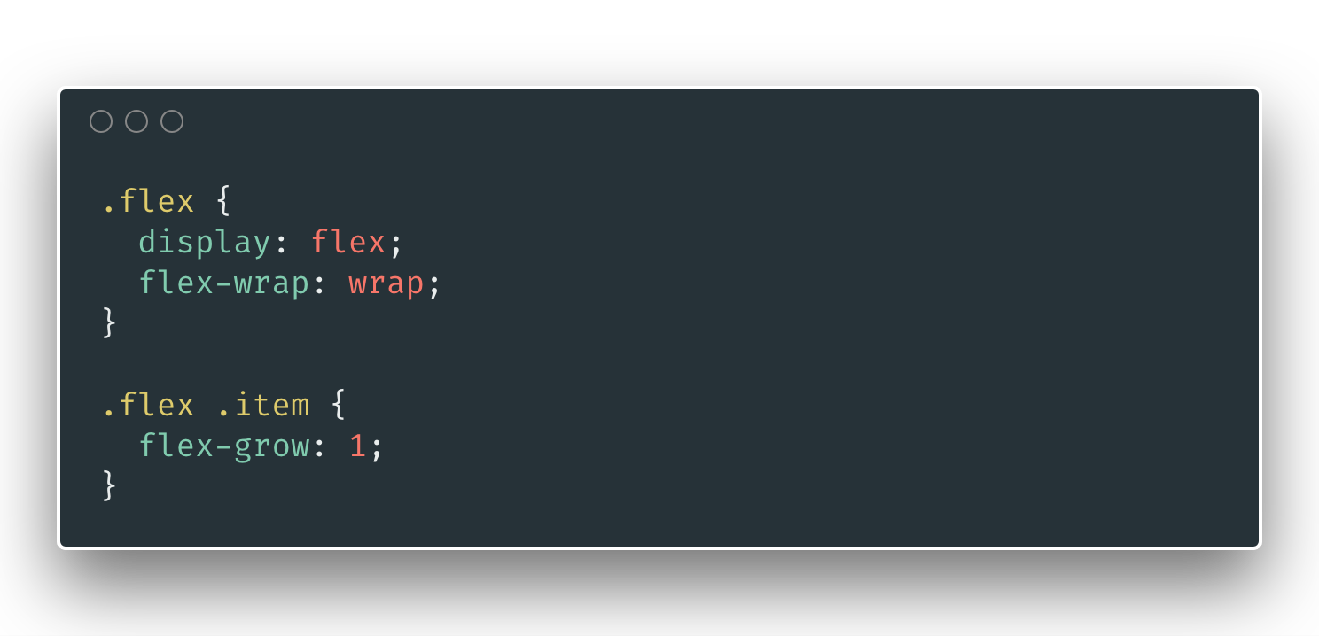
Flex "Grid"
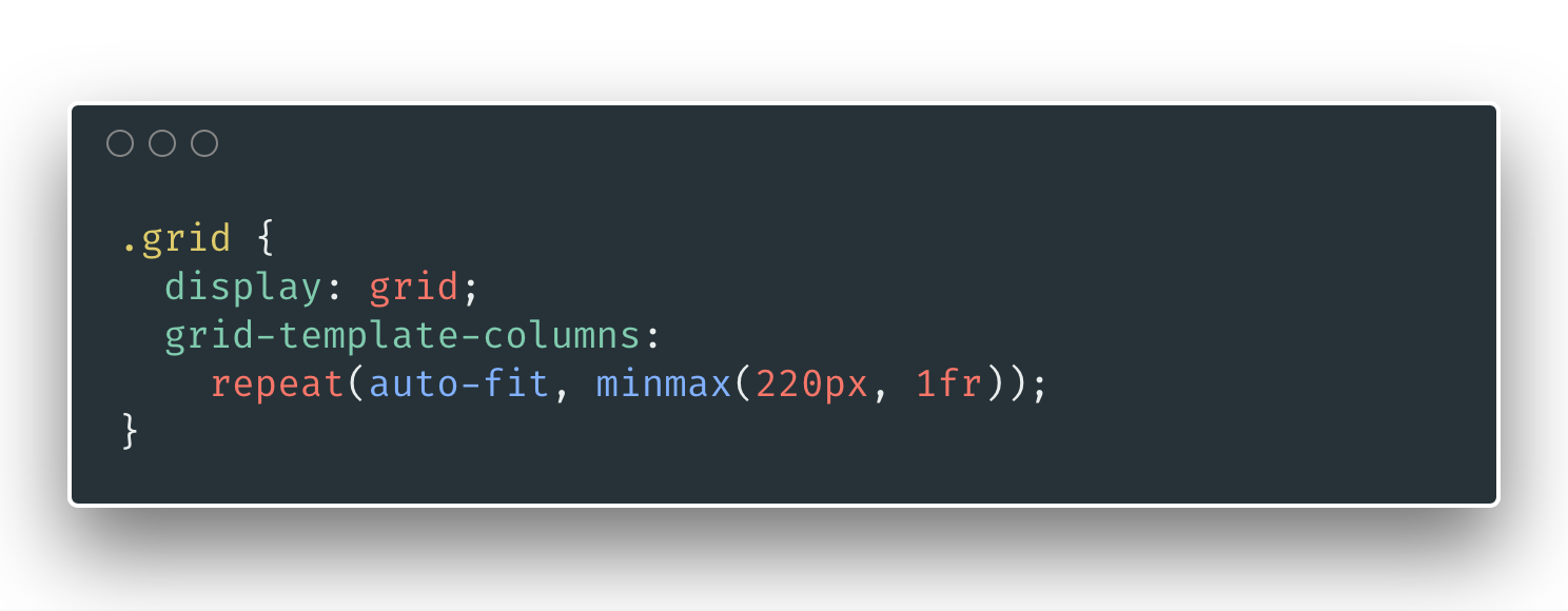
Grid
Grid Layout
2012 -> 2017
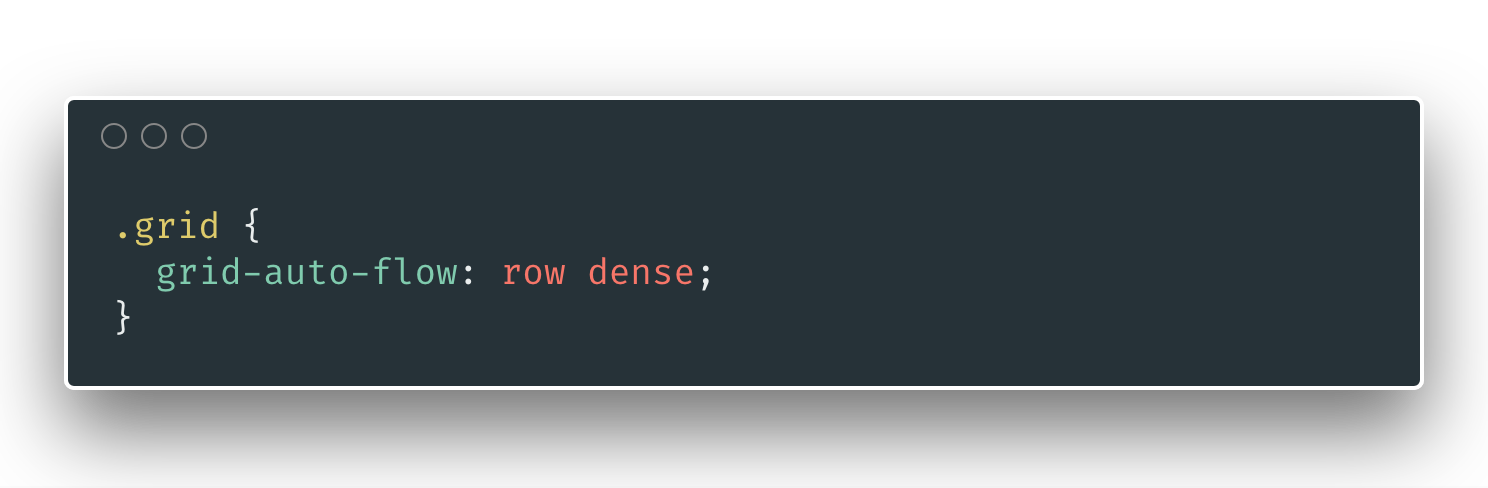
Dense fill
Grid -> Structure
Flex -> Content
Hide content
- Flex +
- overflow hidden +
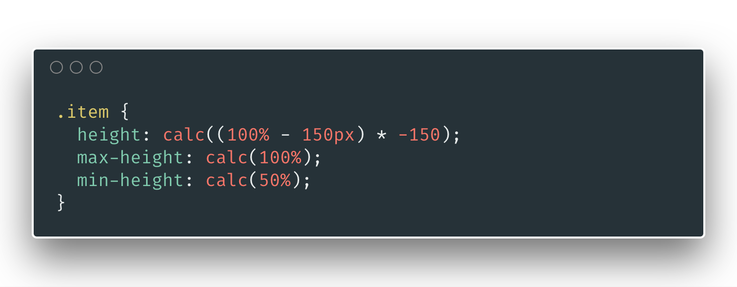
- Min/Max Height Trick
Nested / Reverted Flex
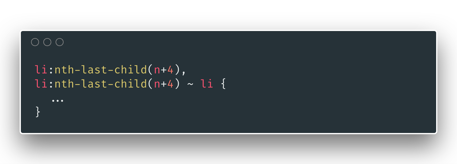
Quantity query
Ok... let's get seriuos
Video player
Cards

A new hope
It is a period of civil war. Rebel spaceships, striking from a hidden base, have won their first victory against the evil Galactic Empire.
During the battle, Rebel spies managed to steal secret plans to the Empire's ultimate weapon, the DEATH STAR, an armored space station with enough power to destroy an entire planet.
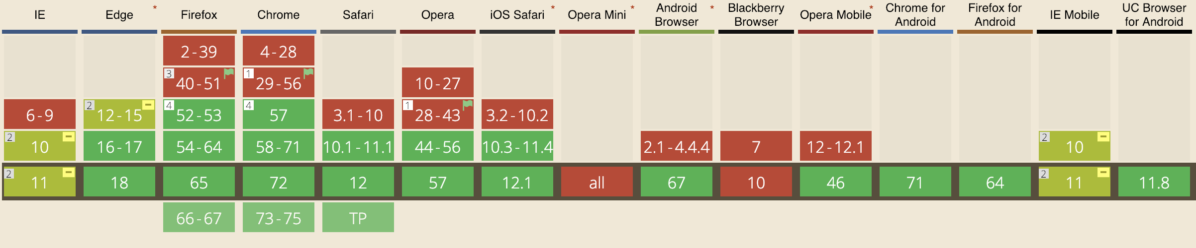
Flexbox compatibility
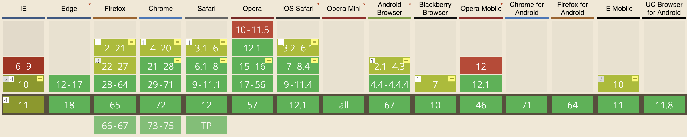
Grid compatibility
And now...
Have fun and discover new solutions!
No media query were harmed in the making of this demos
And please...
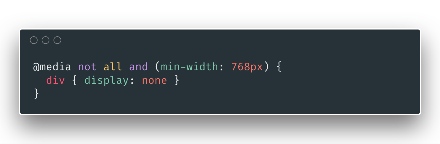
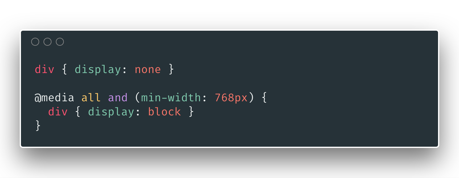
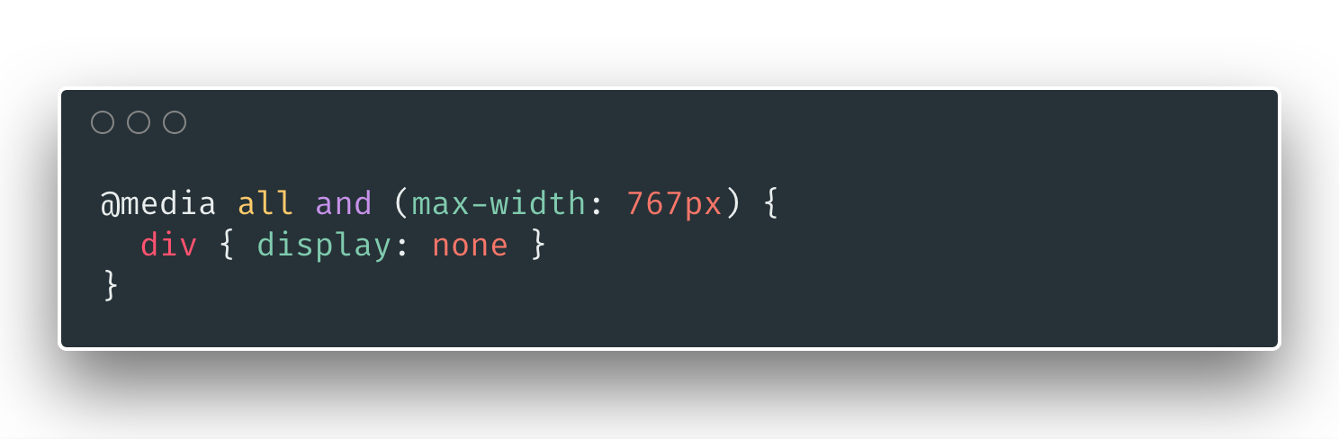
Don't forget the media query `max-width`
This code smells
You can write this
... or this